How to Create a Scroll Animated Portfolio With React
Getting Started with CSS animations in React
Ferenc Almasi • 2023 10 October • 91 min read
Scroll-animated websites can create captivating user experiences, and making a portfolio interactive with animations can stand on its own as a great way to showcase your skills.
In this interactive course, we'll take a look at how to build a portfolio from scratch, animated through scrolling, using React and TypeScript. Before we begin, let's take a look at what we're going to build.
If you'd like to jump to a specific point of interest, you can use the sidebar to navigate between lessons. Each lesson will contain code changes from previous lessons, and the source code for the lessons can also be found on GitHub.
What We Will Build
We'll create three different sections for our portfolio, each with unique animations:
- Hero: When the page opens, we'll introduce the user to a hero section with a reveal animation. Here we'll have a logo, a navigation menu, a simple
h1with a subtitle usingh2, and a call to action. - Projects: The projects section will be revealed as we scroll. We'll look into how to create a linear interpolation function (called lerp) to animate CSS properties tied to the scroll position. We'll also explore how to create a 3D card hover effect with a glow on hover.
- Contact: Lastly, we'll take a look at how to build a basic contact form and create a beating heart animation.

Prerequisites
While we'll go into detail and cover most aspects, this course assumes you have a basic understanding of HTML, CSS, JavaScript, and React. This course won't cover how to use these technologies from scratch. If you're new to any of them, we recommend checking out our roadmaps, where you can learn everything from the start.

The Project Structure
In this project, we'll be using Vite, a front-end tool for building front-end projects. It comes with many different commands to bootstrap projects with different configurations. It supports the following template presets:
| JavaScript | TypeScript |
|---|---|
| vanilla | vanilla-ts |
| vue | vue-ts |
| react | react-ts |
| preact | preact-ts |
| lit | lit-ts |
| svelte | svelte-ts |
| solid | solid-ts |
| qwik | qwik-ts |
We'll be using the react-ts template for this project. This lesson has already been set up with this template. However, you can create a new Vite project by using the following command in your terminal:
npm create vite@latest my-app -- --template react-tsIf you're interested in seeing what a brand new React + TypeScript Vite project looks like, you can check out the following StackBlitz project: React + TypeScript template
Open the sidebar to view the current project files. Each Vite project comes with the following folders and files that we'll make use of:
public: Thepublicfolder is where we can store static assets such as fonts, images, or icons. Anything placed here will remain unaltered by Vite and will be copied to the build folder as-is. This means these files will not be bundled or minified.src: The source code of the project, including components, utility functions, and styles, will be created within thesrcfolder.tsconfig.json: Since this is a TypeScript project, we have atsconfig.jsonfile at the project's root that configures how TypeScript behaves. We'll use it later to set up absolute imports.vite.config.ts: Vite comes with its own configuration file where we can set up plugins, build configurations, and import aliases. We'll use this in conjunction with the TypeScript configuration file to create absolute imports later on.
Setting Up The Project
Let's begin at the very start by setting up the project. Inside the editor, create a new folder named components, and add three subfolders for the three different sections: Hero, Projects, and Contact.
Inside each of these subfolders, create an index.ts file, a .tsx file with the component's name, and an .scss file for the styles. This means you should end up with the following project structure:
src
├─ components
│  ├─ Contact
│  │  ├─ contact.scss
│  │  ├─ Contact.tsx
│  │  ├─ index.ts
│  ├─ Hero
│  │  ├─ hero.scss
│  │  ├─ Hero.tsx
│  │  ├─ index.ts
│  ├─ Projects
│  │  ├─ projects.scss
│  │  ├─ Projects.tsx
│ │ ├─ index.tsBy following this project structure, we can keep components and their styles together. As you can see, we're using Sass in this setup.
npm i sassVite natively supports Sass, but it's still necessary to have the Sass package installed. This has already been taken care of in this project. Inspect the contents of the package.json file to confirm that Sass is included. For now, we can leave the .scss files empty. In each component file, export an h1 so we can verify they appear when we include the components:
export const Hero = () => {
    return (
        <h1>Hero</h1>
    )
}
Repeat the same process for the other files, using appropriate component names. In the index.ts files, simply re-export these components to simplify imports in the future. Inside each index.ts file, add the following line with the correct paths:
export * from './Hero'// Import without index.ts:
import { Hero } from './components/Hero/Hero'
// Import with index.ts:
import { Hero } from './components/Hero'
To finish this first lesson, import the components into App.tsx, and replace the contents of the file with the three components in the following way:
import React from 'react'

import { Hero } from './components/Hero'
import { Projects } from './components/Projects'
import { Contact } from './components/Contact'

export const App = () => {
    return (
        <React.Fragment>
            <Hero />
            <Projects />
            <Contact />
        </React.Fragment>
    )
}Create the Hero Component#
We'll start creating the portfolio from top to bottom. However, before we begin, let's set up a configuration file to store all the information about the portfolio in one place.
This way, we can easily make changes in the future if necessary, without having to modify the components directly. In the project's root directory, create a new file called config.ts and export the following object:
export const config = {
    title: 'Short H1 title of your <b>portfolio</b>',
    subTitle: 'Subtitle, where you can further elaborate about the purpose of your work.',
    navigation: [
        'Projects',
        'Contact'
    ],
    heroCTA: 'Explore Projects',
}We'll use the exported information from this object across all three components. In the Hero component, import the config object. Inside the component, destructure each property from the object. If you get stuck on how to do this, you can find the solution below.
We'll display each of these properties in the appropriate place inside the return statement. Remove everything from the return statement and replace it with the following code to create the layout for the Hero component:
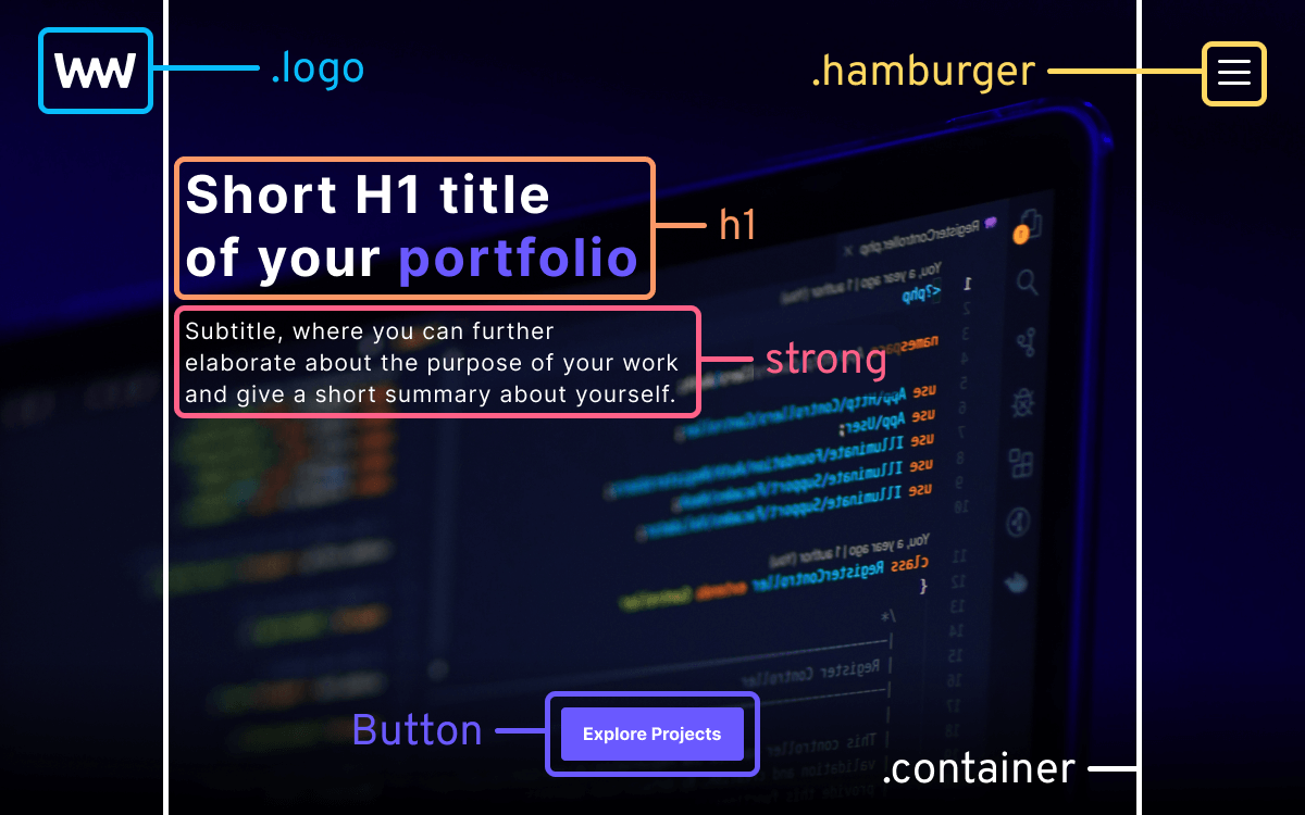
return (
    <section className="hero">
        <div className="container">
            <div className="logo">
                <img
                    src="/assets/img/logo.svg"
                    alt="logo"
                    width="75"
                    height="30"
                />
            </div>
            <h1 dangerouslySetInnerHTML={{ __html: title }} />
            <strong>{subTitle}</strong>

            <div className="hamburger">
                <span className="slice"></span>
                <span className="slice"></span>
                <span className="slice"></span>
                <span className="slice"></span>
            </div>
            <ul className="menu">
                {navigation.map((link, index) => (
                    <li className="menu-item" key={index}>
                        {link}
                    </li>
                ))}
            </ul>
            {heroCTA}
        </div>
    </section>
)Let's review what we did for this component:
- Line 3: We're using a container inside the
.herosection to ensure that the main content of the portfolio remains centered for larger screen sizes. We'll achieve this by setting themax-widthof the container to1200px. - Lines 5-10: In Vite, we can reference static assets from the root of the
publicfolder. For images, always provide analttag to improve accessibility, as well aswidthandheightattributes to prevent layout shifts. Since this image is above the fold, there's no need for lazy loading. - Line 12: The
titlewill be displayed within anh1tag. As thetitlevariable that is exported from the config file contains HTML tags, we need to use thedangerouslySetInnerHTMLprop to correctly render the HTML elements inside theh1tag. - Line 13: The subtitle is wrapped in a
strongtag. We'll useh2tags for the projects and contact sections. - Lines 15-27: We'll use a hamburger menu for the navigation. There are no links involved, as we'll handle scrolling through JavaScript.
At the end of the container, we'll have the heroCTA, but we're currently missing the button. As all buttons will share the same style in the portfolio, let's create a component for it.
Hero componentCreate the Button component
To add the button, create a new folder inside the components folder called Button and add the three files (index file, .tsx, and .scss) similar to the other components.
We can leave the scss file empty for now. For the Button component, add the following lines of code:
import React from 'react'

import './button.scss'

export type ButtonProps = {
    children: React.ReactNode
    onClick: React.MouseEventHandler<HTMLButtonElement>
    className?: string
}

export const Button = ({
    children,
    onClick,
    className
}: ButtonProps) => {
    return (
        <button
            onClick={onClick}
            className={className}
        >
            {children}
        </button>
    )
}When working with typed React components, it's a good practice to export types so that the same types can be reused elsewhere in the project. For buttons, we only need three props at this time:
children: Anything passed between theButtoncomponent will be displayed within the button element. In React, we can typechildrenasReact.ReactNode.onClick: Buttons will trigger specific actions, and for this, we can pass anonClickprop. Click events can be typed usingReact.MouseEventHandler, which is a generic type, allowing us to specify the triggering element.className: We also want to pass class names to style the buttons. This is an optional prop denoted by?.
In the index.ts file, re-export the Button component from Button.tsx:
export * from './Button'To complete this lesson, import the Button component into Hero.tsx, and wrap the heroCTA variable with the component, including an empty onClick event handler. In the next lesson, we'll dive into configuring Sass, adding resets, and styling the Button component.
Configure Sass#
In this lesson, we'll look at how to configure Sass to make applying styles to elements easier down the road. We'll introduce some resets, as well as mixins and variables to share styles across different elements for a consistent look and feel. Create a config folder inside the scss folder, and add the following four new files:
color-palette.scss: This file is dedicated to colors. Separating colors into a distinct file not only makes it easier to maintain color consistency and make changes later on but also simplifies the process of introducing new themes to a project.mixins.scss: We'll take a quick look at how to create mixins in Sass for reusable code. Again, this helps in maintaining consistent styles across components.typography.scss: Just like for colors, we want to have a consistent typography style with specified font types and sizes. This file will contain the necessary variables for typography.variables.scss: Any elements that don't fit into the above three files will be defined in this file.
src
├─ scss
│  ├─ config
│  │  ├─ color-palette.scss
│  │  ├─ mixins.scss
│  │  ├─ typography.scss
│  │  ├─ variables.scss
│ ├─ resets.scssThis categorization is not mandatory for a good project structure. You can organize your files in a meaningful way that makes the most sense to you.
Adding Colors
For this simple portfolio, we'll only work with six individual colors. Open the color-palette.scss file and add the following variables:
$black: #000;
$white: #FFF;
$off-white: #777;
$primary: #6A59FF;
$primary-dark: #0B0063;
$error: #e74c3c;In Sass, variables are created by prefixing their names with a dollar sign. By importing this file, we can access these colors.
Except for $black and $white, it's best to avoid using color names for variables to prevent variable names from becoming meaningless and needing updates after a color change. For instance, if we initially name $primary as $purple and later change the primary color to blue, $purple would lose its meaning. On the other hand, $primary remains meaningful.
Adding typography
For typography, we want to define two font types: regular and bold, along with font weights and sizes for each. To achieve this in Sass, we can use maps. Open the typography.scss file and add the following variables:
$fontTypes: (
    'regular':  (Regular, sans-serif),
    'bold':     (Bold, sans-serif)
);

$fontWeights: (
    'regular':  400,
    'bold':     600
);

$fontSizes: (
    'xs':       12px,
    'sm':       14px,
    'md':       16px,
    'regular':  18px,
    'l':        21px,
    'xl':       24px,
    '2xl':      28px
);A map is a collection of values represented by key-value pairs. Values can include CSS units, such as in the $fontSizes variable, or even lists, which is another structured data type in Sass. Lists are comma-separated sequences of values.
The $fontTypes variable references a custom font that we'll import into the project after we finish setting up our Sass variables.
Adding mixins
To easily use these typography rules, we can create mixins — functions for encapsulating styles. In the mixins.scss file, add the following three mixins:
@mixin media($size: 'xs') {
    $mediasizes: (
        'xs': 600px,
        'sm': 800px,
        'md': 1024px,
        'lg': 1200px
    );

    @media (min-width: #{map-get($mediasizes, $size)}) {
        @content;
    }
}

@mixin fontType($type: 'regular') {
    font-family: #{map-get($fontTypes, $type)};
    font-weight: #{map-get($fontWeights, $type)};
}

@mixin fontSize($size: 'regular') {
    font-size: #{map-get($fontSizes, $size)};
}
Mixins are defined using the @mixin <mixinName> { ... } syntax. When a mixin is used, all CSS-related content within the mixin is generated into the stylesheets. These mixins allow us to access the following functionalities:
media: Use predefined media queries. Mixins can accept parameters just like JavaScript functions. Inside the mixin, we have a$mediasizesmap with different screen sizes. To create a mobile-first media query when the mixin is invoked, we can use themap-getfunction to retrieve a value ($size) from the provided map ($mediasizes).- Note that we need to use the
#{}interpolation to include Sass functions. Anything inside the mixin is placed in place of the@contentkeyword, which is called a content block.
- Note that we need to use the
fontType: We can follow a similar pattern for font types. This mixin relies on the variables defined intypography.scss. We can also set default values for mixin parameters, making them optional when calling the mixin. This way, the mixin defaults to a regular font type.fontSize: Similar to thefontTypemixin, but it requires passing the$fontSizesmap to themap-getfunction.
You can also use map.get, which will replace map-get in future versions of Sass.
Extra variables
Finally, in the variables.scss file, we can include variables that don't fit into the previously created categories. For now, we need the following two variables defined in this file:
$radius: 4px;
$easing: cubic-bezier(.55, 0, .1, 1);Resetting styles
Now that all configurations are in place, let's focus on adding reset styles. To use these configurations, we need to import the files. However, to avoid importing them individually, create a config.scss file next to resets.scss and include the following:
@import './config/color-palette';
@import './config/mixins';
@import './config/typography';
@import './config/variables';We can import this file into resets.scss to automatically import other configurations for us. Open resets.scss and add an import for config.scss, along with the following CSS rules:
@import './config';

@font-face {
    font-family: Regular;
    font-display: swap;
    src: url('/assets/fonts/Inter-Regular.woff2') format('woff2');
}

@font-face {
    font-family: Bold;
    font-display: swap;
    src: url('/assets/fonts/Inter-Bold.woff2') format('woff2');
}

body {
    @include fontType('regular');
    @include fontSize('regular');
    background: $black;
    color: $white;
    margin: 0;
}This is where we define custom fonts. All static assets are already available in the public folder for this project. When specifying the font-family property, we use the same names we've set in the $fontTypes variable in typography.scss.
It's recommended to use font-display: swap when loading custom fonts to reduce layout shifts during font loading. This will improve our core web vitals score.
Notice how we can use mixins and variables:
// Sass also allows the use of comments with "//"
body {
    @include fontType('regular'); // Mixin
    @include fontSize('regular'); // Mixin
    background: $black;           // Variable
    color: $white;                // Variable
    margin: 0;
}We also want to add a couple of resets for other elements to remove unnecessary margins and padding. This is also a good place to add styles for reusable classes, such as for the .container class. Extend resets.scss with the following rules:
section {
    min-height: 100vh;
    padding: 40px;
    box-sizing: border-box;
    position: relative;
}

h1,
h2 {
    margin: 0;
}

ul {
    list-style-type: none;
    padding: 0;
    margin: 0;
}

p {
    line-height: 1.4;
    margin: 0;
}

a {
    text-decoration: none;
}

.container {
    max-width: 1200px;
    margin: 0 auto;
}

@include media('xs') {
    section {
        padding: 120px;
    }
}There's one important rule to point out: section elements need to have at least a minimum height of 100vh to ensure each section completely fills up the screen.
Using the media mixin, we can easily create mobile-first media queries for elements. Keep in mind that anything written inside the mixin will be placed in place of the @content keyword.
Styling the Button component
Now that we've completed the configurations and resets, we can begin styling and animating the Hero component. However, as a final step for this lesson, let's create the styles for the Button component. Open button.scss and include the following styles:
@import '../../scss/config';

button {
    @include fontType('bold');
    @include fontSize('md');
    border: 0;
    background: $primary;
    color: $white;
    padding: 15px 20px;
    border-radius: $radius;
    cursor: pointer;
}For buttons, we want to make them bold and slightly reduce their font size. We'll use the $primary color for the background and $white as the text color to ensure proper color contrast. We also make use of the $radius variable here. Now that we have everything prepared for the Hero component, let's see how to style and animate the elements.
Animate the Hero Component#
To style the Hero component, we first need to import the hero.scss file below the config import in Hero.tsx:
import './hero.scss'Next, open hero.scss, import the Sass config file, and add the following rules to style the main elements:
@import '../../scss/config';

.hero {
    background: url('/assets/img/hero.png');
    background-size: cover;
    background-position: bottom;
    background-repeat: no-repeat;

    .logo {
        height: 30px;
        overflow: hidden;
        position: absolute;
        top: 50px;
        left: 50px;
        z-index: 1;
        animation: LogoAnimation 1s $easing forwards;
    }

    h1 {
        @include fontType('bold');
        font-size: 38px;
        max-width: 400px;
        margin-top: 120px;

        b {
            color: $primary;
        }
    }

    strong {
        @include fontType('regular');
        @include fontSize('l');
        max-width: 450px;
        display: block;
        line-height: 1.4;
        margin-top: 20px;
    }

    button {
        position: absolute;
        bottom: 50px;
        left: 50%;
        transform: translateX(-50%);
    }
}

@include media('xs') {
    .hero h1 {
        margin-top: 30px;
        font-size: 48px;
    }
}Let's break down the rules to understand why they're necessary:
- Lines 4-7: To make the hero image cover the entire screen, we need to set
background-sizetocoverand position the image at the bottom of the container by settingbackground-positiontobottom. - Lines 9-17: The logo will have a writing animation, revealing the logo from left to right by animating the width of its container. To achieve this, we need to set
overflowtohiddenand useanimation-fill-mode: forwardsto ensure the animation stops after completion. We'll create theLogoAnimationin a moment. - Line 26: The
h1can acceptbtags. Here we can set its color to$primaryto allow us to emphasize words visually. - Lines 39-44: We want to position the CTA at the bottom center of the screen. When using
left: 50%, the anchor position is located in the top-left corner of the element. To ensure it's centered, we need to usetranslateX(-50%)to offset it by 50% of its width.
To create the LogoAnimation, create a new file named animations.scss at the root of the scss folder and add the following:
@keyframes LogoAnimation {
    0% { width: 0; }
    100% { width: 75px; }
}We'll collect animations in this file. We animate the width from 0 to 75px, which is the width of the logo. To make animations available throughout the project, import this file in resets.scss after the config import.
Animating the menu
Now that we have an animated logo, let's focus on the hamburger menu. You'll notice from the gif that we visually have three bars, but there are four .slice elements inside Hero.tsx. The fourth element is hidden behind the middle bar.

This hidden element will be animated into a cross shape with rotation, while simultaneously hiding the top and bottom bars. To align the bars correctly, add the following rules to hero.scss after the button selector:
.hamburger {
    position: absolute;
    top: 50px;
    right: 50px;
    width: 40px;
    height: 25px;
    user-select: none;
    cursor: pointer;
    z-index: 1;

    &.animate-in .slice {
        opacity: 0;
        animation: MenuSlideIn .6s $easing forwards;
    }

    .slice {
        position: absolute;
        width: 100%;
        height: 3px;
        border-radius: $radius;
        background: $white;
        transition: all .3s $easing;

        &:first-child {
            top: 0;
        }

        &:nth-child(2),
        &:nth-child(3) {
            top: 45%;
            animation-delay: .2s;
        }

        &:last-child {
            bottom: 0;
            animation-delay: .4s;
        }
    }
}The important parts are highlighted. We have an animate-in class that initially sets the opacity of the .slice elements to 0. We'll create the MenuSlideIn animation for this shortly.
For the .slice elements, we can use absolute positioning to align them at the top (first-child), middle, and bottom (last-child) of the container. Note that the second and third children share the same position. These elements will be turned into a cross, and an additional class will animate them. Inside the .hamburger selector, add the following new rules:
&.close {
    .slice:first-child,
    .slice:last-child {
        opacity: 0;
    }

    .slice:first-child {
        transform: translateY(20px) scale(0);
    }

    .slice:last-child {
        transform: translateY(-20px) scale(0);
    }

    .slice:nth-child(2) {
        transform: rotate(45deg);
    }

    .slice:nth-child(3) {
        transform: rotate(-45deg);
    }
}- The first and last children are animated to the middle position, making them invisible by scaling and reducing opacity.
- The second and third children are rotated by (+/-)45° to form a cross.
This class can be toggled through an onClick event listener in our Hero component. Open the Hero component and add the following new lines to introduce both .close and .animate-in classes:
import { useState } from 'react'

import { Button } from '../Button'

import { config } from '../../../config.ts'
import { classNames } from '../../utils.ts'

import './hero.scss'

export const Hero = () => {
    const [menuOpen, setMenuOpen] = useState(false)
    const [mounted, setMounted] = useState(false)

    const {
        title,
        subTitle,
        navigation,
        heroCTA
    } = config

    const toggleMenu = () => setMenuOpen(!menuOpen)

    setTimeout(() => {
        setMounted(true)
    }, 700)

    return (
        <section className="hero">
            <div className="container">
                <div className="logo">
                    <img
                        src="/assets/img/logo.svg"
                        alt="logo"
                        width="75"
                        height="30"
                    />
                </div>
                <h1 dangerouslySetInnerHTML={{ __html: title }} />
                <strong>{subTitle}</strong>

                <div
                    className={classNames([
                        'hamburger',
                        menuOpen && 'close',
                        !mounted && 'animate-in'
                    ])}
                    onClick={toggleMenu}
                >
                    <span className="slice"></span>
                    <span className="slice"></span>
                    <span className="slice"></span>
                    <span className="slice"></span>
                </div>
                <ul className="menu">
                    {navigation.map((link, index) => (
                        <li className="menu-item" key={index}>
                            {link}
                        </li>
                    ))}
                </ul>
                <Button onClick={() => {}}>
                    {heroCTA}
                </Button>
            </div>
        </section>
    )
}On line:47, we trigger the toggleMenu function when the hamburger menu is clicked, toggling the menuOpen state. This state determines whether to add the .close class to the hamburger menu.
We also have a mounted state that is set to true after 700ms using a setTimeout. This state is responsible for removing the .animate-in class from the hamburger menu after the animation completes.
We've set the animation duration to 600ms for the menu, so we can time the setTimeout to 700ms to remove the class only after the animation finishes.
We also have an import for a classNames function imported from a file called utils.ts. We don't have this file yet, so create the file in the same directory as App.tsx and export the following function:
export const classNames = (
  arr: Array<string | null | boolean | undefined>
): string | undefined => arr?.filter(Boolean).join(' ')This function will be responsible for conditionally applying class names to elements. It's a lightweight alternative to the popular classNames library. Now, whenever we click on the hamburger icon, it animates into the close state. However, we still need to create the animation for the .animate-in class. Go to animations.scss and add the following keyframes:
@keyframes MenuSlideIn {
    0% {
        opacity: 0;
        transform: translateX(20px);
    }
    100% {
        opacity: 1;
        transform: translateX(0);
    }
}This creates a transform animation, sliding elements into view with a fade-in effect through opacity. As we applied animation delays to subsequent .slice elements, we'll have a sequence of animations:
Animating menu items
The navigation elements need styling to show only when the hamburger menu is active. To achieve this, extend the hero.scss file with the following CSS rules, just under the .hamburger element:
.menu {
    position: absolute;
    right: 50px;
    width: 100px;
    height: 100px;
    top: 100px;
    overflow: hidden;
    z-index: 1;

    &.visible .menu-item {
        right: 0;
    }

    .menu-item {
        position: absolute;
        right: -100%;
        transition: all 0.6s $easing;
        cursor: pointer;

        &:first-child {
            top: 0;
        }

        &:nth-child(2) {
            top: 30px;
            transition-delay: 0.1s;
        }
    }
}This absolutely positions the .menu element under the .hamburger, with fixed dimensions and overflow set to hidden. This allows us to create another slide-in animation for the menu items. By default, their right position is set to -100%, making them invisible as they overflow their container. When the navigation is toggled, this position is animated back to 0.
Whenever working with animating properties, be sure to include a transition property on the element to smoothly transition between the two states.
Of course, we also need to conditionally apply the .visible class to the menu. To do this, replace the ul inside Hero.tsx with the following:
- <ul className="menu">
+ <ul className={menuOpen ? 'menu visible' : 'menu'}>Intro animation
Now we have animated menus as well. A final touch for the Hero component is an intro animation that acts like a curtain pulling up after the logo and menu animations finish. Inside Hero.tsx, add the following element after the Button component:
<Button onClick={() => {}}>
    {heroCTA}
</Button>
<div className="curtain" />We'll style this element to fully cover the Hero component and slowly slide up after the logo and menu animations are finished, creating the following effect:

We can achieve this by animating its height from 100% to 0. Open hero.scss and add the following styles for the .curtain element:
.curtain {
    position: absolute;
    top: 0;
    left: 0;
    width: 100%;
    height: 100%;
    background: $black;
    transition: height .3s $easing;
    animation: CurtainSlideUp .9s $easing forwards .6s;
}This calls the CurtainSlideUp animation and plays it over 900ms. The animation is delayed by 600ms, so it starts only after the logo and menu animations finish. To add the CurtainSlideUp animation, open animations.scss and create a new animation that animates the height attribute from 100% to 0.
Adding scroll to menu items
There's one last thing missing from our Hero component, and that is scrolling to the appropriate sections when we click on one of the menu items. For this, we can create another utility function. Export the following function from utils.ts:
export const scrollTo = (element: string, index?: number) => index
    ? document
        .querySelectorAll(element)?.[index]
        ?.scrollIntoView({ behavior: 'smooth' })
    : document
        .querySelector(element)
?.scrollIntoView({ behavior: 'smooth' })This function expects an element and an optional index. If an index is provided, it'll use querySelectorAll to select the correct element from a NodeList. Otherwise, it'll use querySelector, which returns a single element. Using scrollIntoView with behavior set to smooth, we can animate the scroll. Import this function into the Hero component and add the highlighted lines of code to enable scrolling:
...
import { classNames, scrollTo } from '../../utils.ts'

import './hero.scss'

export const Hero = () => {
    const [menuOpen, setMenuOpen] = useState(false)
    const [mounted, setMounted] = useState(false)

    const { ... } = config

    const scroll = (index: number) => {
        scrollTo('section', index)
        setMenuOpen(false)
    }

    const toggleMenu = () => setMenuOpen(!menuOpen)

    setTimeout(() => { ... }, 700)

    return (
        <section className="hero">
            <div className="container">
                <div className="logo">...</div>
                <h1 dangerouslySetInnerHTML={{ __html: title }} />
                <strong>{subTitle}</strong>

                <div>...</div>
                <ul className="menu">
                    {navigation.map((link, index) => (
                        <li
                            className="menu-item"
                            key={index}
                            onClick={() => scroll(index + 1)}
                        >
                            {link}
                        </li>
                    ))}
                </ul>
                <Button onClick={() => scroll(1)}>
                    {heroCTA}
                </Button>
            </div>
        </section>
    )
}The scroll helper function closes the hamburger menu every time a menu item is clicked. We also want to attach the same functionality to the Button component, which triggers a scroll to the first section element, the container for the projects section. We'll build this next. With this, you've successfully created the Hero component!
Setup Projects Component#
Now that we've successfully completed building the Hero component, let's move on to the next section, where we'll display a list of projects animated by the scroll position of the browser. In this section, we're going to display new information, just like we did for the Hero component. We'll source this information from our config file. Open config.ts and extend it with the following properties:
export const config = {
...
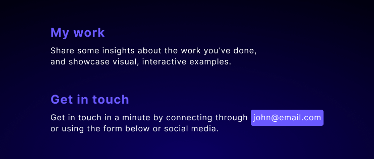
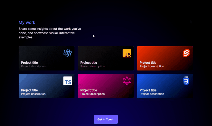
projectsTitle: 'My work',
projectsDescription: 'Share some insights about the work you’ve done...',
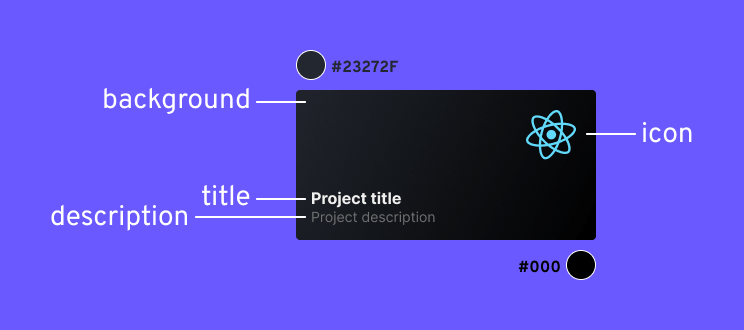
projects: [
{
url: 'link-to-github',
icon: 'react',
title: 'Project title',
description: 'Project description',
background: '#23272F',
},
{
url:'link-to-project-page',
icon: 'javascript',
title: 'Project title',
description: 'Project description',
background: '#272327'
},
{
url: 'link-to-netlify-app',
icon: 'svelte',
title: 'Project title',
description: 'Project description',
background: '#FF3E00',
color: '#FFF'
}
],
projectsCTA: 'Get in Touch',
}Each project will have the following properties that we'll use in our component within a loop:
url: A link where the card will lead the user upon click.icon: The name of the icon in theiconsfolder. The URL to the image will be created dynamically.title: The project's title in bold.description: A brief description about the project, displayed under the title.background: The background color of the project tile. We'll use a linear gradient to create a dynamic background from black to the color specified in this property.color: The color of the description. If not set, it'll default to an off-white color. Otherwise, the color specified here will be used.
Now that we have all the information ready, let's create the layout, and then we'll apply the styles. Open Projects.tsx and replace the component with the following code:
import { Button } from '../Button'

import { config } from '../../../config.ts'
import { scrollTo } from '../../utils.ts'

import './projects.scss'

export const Projects = () => {
    const {
        projectsTitle,
        projectsDescription,
        projects,
        projectsCTA
    } = config

    return (
        <section className="project-section">
            <div className="container">
                <ul className="projects">
                    {projects.map((project, index) => (
                        <li
                            key={index}
                            style={{
                                background: `linear-gradient(
                                    315deg,
                                    #000 0%,
                                    ${project.background} 100%
                                )`
                            }}
                        >
                            <a href={project.url}>
                                <img
                                    src={`/assets/icons/${project.icon}.svg`}
                                    alt={project.icon}
                                    width="50"
                                    height="50"
                                    loading="lazy"
                                />

                                <b>{project.title}</b>
                                <span style={{ color: project.color }}>
                                    {project.description}
                                </span>
                            </a>
                            <div className="texture" />
                        </li>
                    ))}
                </ul>
                <Button
                    onClick={() => scrollTo('.contact')} className="project-cta"
                >
                    {projectsCTA}
                </Button>
            </div>
        </section>
    )
}Just as we did with the Hero component, we use a .container inside this section too. To display the projects, we can use a simple map:
- Lines 23-29: We can use the
styleattribute to dynamically create the background gradient. We use a linear gradient at a 315-degree angle, starting from#000toproject.background. To experiment with different gradient configurations, you can use tools such as cssgradient.io. - Lines 32-38: We create the full URL for the icon. For the
alttext, we can use the icon name. Note that we need thewidthandheightattributes to avoid layout shifts. As these icons are below the fold, we also need to lazy load them by setting theloadingattribute tolazy. - Line 41: We can use the
styleattribute again to dynamically set the color for the project description. If no color is specified for the object, thestyleattribute will be omitted automatically. - Line 45: We also have an empty
divwith a class of.texture. This will be used to create a subtle texture for the cards via CSS. - Lines 49-53: For the button, we can reuse the previously created
scrollTofunction to trigger a scroll to the contact section.
Adding the Section component
Currently, we're missing the projectsTitle and projectsDescription variables from the layout. As they share the same style with the title and description in the contact section, we can create a new component for this part.
Inside the components folder, create a new folder called Section and replicate the same structure as currently exists for the other components.
Once the files are created, add the following code to the Section.tsx file to create the Section component, and don't forget to re-export it through the index.ts file.
import React from 'react'

import './section.scss'

export type SectionProps = {
    title: string
    description: string
}

export const Section = ({
    title,
    description
}: SectionProps) => {
    return (
        <React.Fragment>
            <h2 className="section-title">
                {title}
            </h2>
            <p
                className="section-content"
                dangerouslySetInnerHTML={{ __html: description }}
            />
        </React.Fragment>
    )
}This component will use an h2 and a p tag to display the title along with the description. As the description can contain HTML tags, we need to use the dangerouslySetInnerHTML prop on the p tag. To create the styles for this element, open section.scss and add the following code:
@import '../../scss/config';

.section-title {
    @include fontSize('xl');
    margin-bottom: 10px;
    color: $primary;
}

.section-content {
    max-width: 400px;

    a {
        color: #FFF;
        background: $primary;
        padding: 2px 4px;
        border-radius: $radius;
    }
}Inside the Projects component, import the Section component and include it before the ul element while passing projectsTitle and projectsDescription as props.
Styling the projects section
We have everything in place to start applying styles for the project section. We can get the styling done relatively quickly with just a couple of rules. Open projects.scss and add the following styles:
@import '../../scss/config';

.project-section {
    background: radial-gradient(ellipse at bottom center, $primary-dark 0%, $black 75%);

    .projects {
        display: grid;
        gap: 20px;
        margin-top: 40px;

        li {
            border-radius: $radius;
            padding: 15px;
            background: $black;
            transition: all .3s ease-out;
            position: relative;

            .texture {
                border-radius: $radius;
                background-image: url('/assets/img/card.png');
                mix-blend-mode: color-burn;
                pointer-events: none;
                position: absolute;
                top: 0;
                left: 0;
                width: 100%;
                height: 100%;
            }
        }

        a {
            color: $white;
        }

        img {
            margin-left: auto;
            display: block;
        }

        b {
            display: block;
            margin-top: 20px;
        }

        span {
            @include fontSize('md');
            color: $off-white;
        }
    }

    .project-cta {
        display: block;
        margin: 100px auto 0;
    }
}

@include media('xs') {
    .projects {
        grid-template-columns: repeat(2, 1fr);
    }
}

@include media('sm') {
    .projects {
        grid-template-columns: repeat(3, 1fr);
    }
}This will create a radial gradient as the background for the project section. We can position the gradient at the bottom center using the at bottom center keywords. For the .projects element, we want to display it as a grid. Initially, cards will be displayed in a single column. At each wider media query, we'll increase the column count until it reaches a maximum of three columns. This is done using the media mixins at the bottom.
As for the project cards themselves, we want to completely overlay the texture using absolute positioning, as seen in lines 23-27. Note that without setting the parent element's position to relative, absolute positioning will not take effect.
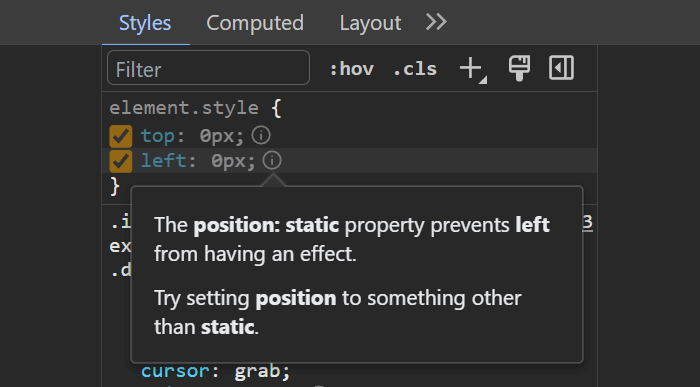
absolute positioning, top and left will not be appliedTo ensure the texture doesn't cover the elements but only applies a texture to the background, we can use mix-blend-mode. Experiment with different values for mix-blend-mode to see their effects. Also, make sure to set pointer-events to none to prevent the element from capturing any click events.
With this, we're basically done styling our Project component. In the next lesson, we'll explore how to add scroll animations.
Add Scroll Animations#
Animating elements on scroll can be achieved in several different ways. One popular option for attaching animations to scrolls is to use a popular library called GSAP. However, it comes with many extra helper functions that we won't need for this portfolio. Instead, we'll look at how to create animations using regular JavaScript functions.
This approach will reduce our overall JavaScript bundle size and help improve our understanding of how scroll animations work. The idea behind animating elements on scroll is simple and can be broken down into four main steps:
- Create a state for keeping track of styles, such as
opacity. - Attach a scroll event listener to the
window. - Update the state inside the event listener based on the position of elements.
- Attach the state to the elements using the
styleattribute.
We'll follow these steps to create the animations. Let's start by creating the state. Inside the Projects component, create the following new state for the animations and a new reference for the section element:
import { useEffect, useState, useRef } from 'react'

...

export const Projects = () => {
    const { ... } = config

    const sectionRef = useRef<null | HTMLElement>(null)
    const [animation, setAnimation] = useState({
        heading: {
            opacity: 0,
            transform: 0
        },
        description: {
            opacity: 0,
            transform: 0
        },
        projects: Array(projects.length).fill({
            opacity: 0,
            transform: 0
        }),
        cta: {
            opacity: 0,
            transform: 0
        }
    })

    useEffect(() => {
        window.addEventListener('scroll', () => {
            // We'll update the state here
        })
    }, [projects])

    return (
        <section className="project-section" ref={sectionRef}>...</section>
    )
}Each element inside the projects section will have its opacity and transform animated. To keep all of these elements in one state, we can use an object.
For the projects property, we want to create as many elements as there are projects inside our configuration file. For this, we can use Array(projects.length).fill(...). This will create an array with x number of elements, all filled with an opacity and transform property.
// Mock projects
const projects = [1, 2, 3]

// Generating arrays based on the `projects` variable
Array(projects.length) // Returns [3 x empty]

// Generating the same object 3 times
Array(projects.length).fill({
    opacity: 0,
    transform: 0
})After the useState hook, we've also created a useEffect for updating the state, with an empty scroll event listener. This is where we'll update the animation state. Note that we need to pass projects as a dependency to avoid unnecessary re-renders.
Don't forget to pass sectionRef to the ref property of the section element.
With this in place, we only need the last two steps. So how do we actually update the state based on the scroll position? We want to begin animating when the project's section element starts appearing in the viewport. To calculate the position of the element, add the following lines to the scroll event listener:
const top = window.scrollY - sectionRef.current!.offsetTop

if (top <= 100) {
    console.log(top)
}The top variable will contain the position of the section element relative to the viewport. When the top variable equals zero, it means the section element is situated in the middle of the viewport. At this stage, all elements should be in their final positions. So how do we update the animation state based on the scroll position? Enter the world of interpolation.
Linear interpolation
Linear interpolation, also known as lerp for short, is a method to linearly map one value to another. For example, if we have a scale from 0 to 100, and we want to map the values to a scale between 0 to 1, a value of 0.5 would equal 50. This can be achieved by using linear interpolation. Take the following function as an example:
This essentially returns the percentage between two values, eg 50% of 100. The lerp function takes in three variables:
x: The starting position of the scale.y: The ending position of the scale.z: A percentage between 0 and 1.
Experiment with different values to see how the lerp function can give back the percentage of the passed scale. The opposite of this function is called an inverse lerp, where we get back a decimal value — the third parameter of the above function:
This also makes use of a clamp function internally, which ensures that if a number falls outside of a given range, it'll either return the minimum value (if it's smaller than the minimum number) or the maximum value (if it's larger than the maximum number). Otherwise, it'll return the number as is.
Combining lerp and invlerp
These three functions (clamp, lerp, and invlerp) can help us create a function that maps the scroll position to certain values. The reason we need both lerp and invlerp is because the output can differ based on the CSS property.
For example, for opacity, we want to map the scroll position to a value between 0 and 1. However, for a translate property, it can be a range of anything from 30px to 0, 0 to 50px, or any other ambiguous number. We can solve this by allowing the developer to pass the desired output values. Take the following as an example:
// Accepts a value, as well as the input and output ranges
const interpolate = (
    value: number,
    input: [x: number, y: number],
    output: [x: number, y: number],
) => ...

// Map the value of `top` between -600 and -400 to a value between 0 an 1
interpolate(top, [-600, -400], [0, 1])
interpolate(top, [-600, -400], [30, 0])We can translate the above two function calls as:
- Map the value of
topbetween -600 and -400 to a value between 0 and 1. - Map the value of
topbetween -600 and -400 to a value between 30 and 0.
This configurability makes the interpolate function extremely flexible, and now it can be used to apply animation to any CSS property. So, how does this interpolate function work? It combines a lerp with an invlerp:
export const interpolate = (
    value: number,
    input: [x: number, y: number],
    output: [x: number, y: number],
) => lerp(output[0], output[1], invlerp(input[0], input[1], value))This may look a bit intimidating at first, but it works in a simple way:
- It returns a
lerpfunction that accepts a range of values and a decimal. Thelerpfunction returns the value betweenoutput[0]andoutput[1]based on the passed decimal as the third parameter. - The third parameter of the
lerpfunction is generated by aninvlerpusinginput[0]andinput[1], as well as thevalue. This returns a decimal value that is passed over to thelerpfunction. Thelerpfunction then maps the input range to the correct output range.
// Map 50 between 0 and 100 to 0 and 1
interpolate(50, [0, 100], [0, 1]) // Returns 0.5

// Map 50 between 0 and 100 to 0 and 50
interpolate(50, [0, 100], [0, 50]) // Returns 25Animating CSS properties
Now that we understand how lerp and invlerp work, export them along with the clamp and interpolate functions from the utils.ts file:
export const clamp = (
    num: number,
    min: number,
    max: number
    ) => Math.min(Math.max(num, min), max)

export const lerp = (
    x: number,
    y: number,
    z: number
) => x * (1 - z) + y * z

export const invlerp = (
    x: number,
    y: number,
    z: number
) => clamp((z - x) / (y - x), 0, 1)

export const interpolate = (
    value: number,
    input: [x: number, y: number],
    output: [x: number, y: number],
) => lerp(output[0], output[1], invlerp(input[0], input[1], value))While we've exported everything for later use, in this course, we're only going to make use of the interpolate function in the Projects component. Open the Projects component and inside the if statement in the scroll event listener, define the following list of opacities, and transform rules after importing the interpolate function from the utils:
// Don't forget to update the import statement
import { scrollTo, interpolate } from '../../utils.ts'

// Inside the if statement, follow the structure of the animations state
if (top <= 100) {
    const opacities = {
        heading: interpolate(top, [-400, 0], [0, 1]),
        description: interpolate(top, [-300, 0], [0, 1]),
        projects: [
            interpolate(top, [-600, -400], [0, 1]),
            interpolate(top, [-400, -200], [0, 1]),
            interpolate(top, [-200, 0], [0, 1]),
            interpolate(top, [-600, -400], [0, 1]),
            interpolate(top, [-400, -200], [0, 1]),
            interpolate(top, [-200, 0], [0, 1])
        ],
        cta: interpolate(top, [-400, 0], [0, 1]),
    }

    const transforms = {
        heading: interpolate(top, [-400, 0], [20, 0]),
        description: interpolate(top, [-300, 0], [20, 0]),
        projects: [
            interpolate(top, [-600, -400], [30, 0]),
            interpolate(top, [-400, -200], [30, 0]),
            interpolate(top, [-200, 0], [30, 0]),
            interpolate(top, [-600, -400], [30, 0]),
            interpolate(top, [-400, -200], [30, 0]),
            interpolate(top, [-200, 0], [30, 0])
        ],
        cta: interpolate(top, [-400, 0], [50, 0]),
    }
}For each property inside the state, we've created a new interpolate function with different configurations. For example:
heading: Animate theopacitybetween 0 and 1 when the scroll position is between -400 and 0.description: Animate theopacitybetween 0 and 1 when the scroll position is between -300 and 0.
You can try logging some of the values to the console to see how they change based on the scroll position.
This way, we can create intricate animations with simple rules. For the projects, we want to animate each column one after the other. Notice the repeating pattern:
interpolate(top, [-600, -400], [0, 1])
interpolate(top, [-400, -200], [0, 1])
interpolate(top, [-200, 0], [0, 1])

interpolate(top, [-600, -400], [0, 1])
interpolate(top, [-400, -200], [0, 1])
interpolate(top, [-200, 0], [0, 1])This means that the cards inside each column will be animated simultaneously. To update the state based on these interpolate functions, all we have to do is call setAnimation with the proper references. After the transforms variable, add the following updater function to update the state with the interpolated values:
setAnimation({
    heading: {
        opacity: opacities.heading,
        transform: transforms.heading
    },
    description: {
        opacity: opacities.description,
        transform: transforms.description
    },
    projects: Array(projects.length).fill({
        opacity: 0,
        transform: 0
    }).map((_, index) => ({
        opacity: opacities.projects[index],
        transform: transforms.projects[index]
    })),
    cta: {
        opacity: opacities.cta,
        transform: transforms.cta
    }
})Attaching styles
We're only one last step away from seeing the animations. Now that we have the interpolated values, we need to attach them to the elements using style attributes. Let's go from top to bottom and start with the heading and description. As these are displayed through the Section component, we need to create new props to pass the styles. Modify the Section component according to the following:
import React from 'react'

import './section.scss'

export type SectionProps = {
    title: string
    description: string
    headingStyles?: React.CSSProperties
    contentStyles?: React.CSSProperties
}

export const Section = ({
    title,
    description,
    headingStyles,
    contentStyles
}: SectionProps) => {
    return (
        <React.Fragment>
            <h2
                className="section-title"
                style={headingStyles}
            >
                {title}
            </h2>
            <p
                className="section-content"
                dangerouslySetInnerHTML={{ __html: description }}
                style={contentStyles}
            />
        </React.Fragment>
    )
}We can make these props optional by using the ? annotation for the type. The correct type for style attributes in React is React.CSSProperties. Now we can pass the animated state to this component by updating the Section component inside Projects.tsx as follows:
<Section
    title={projectsTitle}
    description={projectsDescription}
    headingStyles={{
        opacity: animation.heading.opacity,
        transform: `translateX(-${animation.heading.transform}px)`
    }}
    contentStyles={{
        opacity: animation.description.opacity,
        transform: `translateX(-${animation.description.transform}px)`
    }}
/>We can use string interpolation to inject transform rules inside a translateX function. We want the title and the description to slide in from the left side, for which we need to use negative values. Both of them will be animated on the x-axis from -20px to 0.
We want to follow the same logic for the project cards and the CTA. Expand the style property of the li elements with the following two properties:
<li
    key={index}
    style={{
        background: `linear-gradient(...)`,
        opacity: animation.projects[index].opacity,
        transform: `translateY(${animation.projects[index].transform}px)`
    }}
>Lastly, try implementing the same logic for the Button component. Don't forget to pass the props to the component! If you get stuck with the implementation, you can reveal the solution below.
And with that being said, now you have a scroll-animated projects section where cards are revealed depending on the scroll position! In the next lesson, we'll take a look at how to make the cards have a 3D effect on hover.
3D Card Animation#
To create 3D card animations, we want to dynamically add a CSS transform when an element is hovered. When the element is being hovered, we'll calculate the cursor's position on the element to attach dynamic scale3d and rotate3d rules using CSS. For this, we'll need to introduce two new event listeners on the li element:
const rotate = (event: React.MouseEvent<HTMLLIElement>) => {
    console.log('hover')
}

const resetStyles = (event: React.MouseEvent<HTMLLIElement>) => {
    console.log('hover out')
}

// Inside the return:
<ul className="projects">
    {projects.map((project, index) => (
        <li
            key={index}
            style={{ ... }}
            onMouseMove={rotate}
            onMouseLeave={resetStyles}
>Create the rotate and resetStyles functions above the useEffect hook, and attach them to the onMouseMove and onMouseLeave events on the li. When we hover the li, the onMouseMove function will be executed. When the li loses focus, the function in the onMouseLeave listener will be called.
In the rotate function, we'll change the element's transform rule to create a 3D effect. In the resetStyles function (which is called when the li loses focus), we'll reset the transform rule to remove the 3D effect. To create the 3D effect, add the following lines to the rotate function:
const rotate = (event: React.MouseEvent<HTMLLIElement>) => {
    const target = event.currentTarget
    const bounds = target.getBoundingClientRect()

    const mouseX = event.clientX
    const mouseY = event.clientY

    const left = mouseX - bounds.x
    const top = mouseY - bounds.y

    const center = {
        x: left - bounds.width / 2,
        y: top - bounds.height / 2
    }

    target.style.transform = `
        scale3d(1.1, 1.1, 1.1)
        rotate3d(
            ${center.y},
            ${-center.x},
            0,
            15deg
        )
    `;
}The 3D effect works by calculating the mouse's position on the element and updating the transform rule based on its position. Let's cover each line to better understand how this function works.
- Line 3: We get the bounding client of the element, which returns its width and height and its position relative to the viewport.
- Lines 5-6: We also need the mouse position, which we can get using
event.clientXandevent.clientY. - Lines 8-9: We need to calculate the top and left position of the card, which we can use to later calculate the center position as well. We want to emphasize the effect as the mouse gets closer to the edges of the card, which means the effect will be barely visible when the mouse is in the center of the card.
- Lines 18-23: We can apply a
scale3dandrotate3deffect to animate the card when the mouse moves. Notice that thexandyvalues are switched.rotate3dexpects thexvalue first, but we pass theyto make the rotation opposite to the mouse movement direction.
However, the animation is currently a little bit off. This is because we're missing a CSS property. Whenever working with 3D in CSS, we need to define a perspective on the 3D element's parent to tell the browser how far the 3D objects are from the user. Inside projects.scss, add the following to the .projects element:
.projects {
    display: grid;
    gap: 20px;
    margin-top: 40px;
perspective: 5000px;You can experiment with different effects by switching the values or changing the degree in the rotate3d rule. You can also make the effect less or more dramatic by either increasing (making it less prominent) or decreasing (making it more prominent) the CSS perspective property.
However, when the card loses focus, the transform stays. Try resetting the transform rule in the resetStyles function.
Adding a glow effect
To emphasize the 3D effect, let's also add a glow effect to the cards. We can achieve this by applying a semi-transparent radial gradient over the cards:
Add a new empty div after the .texture element with a className of glow:
<div className="texture" />
<div className="glow" />Inside projects.scss, define the same positioning for the .glow element as we have for the texture. As they share the same styles, we can remove them from the .texture element and create a shared selector in the following way:
#readonly
  .texture {
      border-radius: $radius;
      background-image: url('/assets/img/card.png');
      mix-blend-mode: color-burn;
      pointer-events: none;
-     position: absolute;
-     top: 0;
-     left: 0;
-     width: 100%;
-     height: 100%;
-   }

+ .texture,
+ .glow {
+     position: absolute;
+     top: 0;
+     left: 0;
+     width: 100%;
+     height: 100%;
+ }To add the glow effect, extend the rotate function with the following lines of code which will attach a radial-gradient to the element dynamically.
(target.querySelector('.glow') as HTMLDivElement).style.backgroundImage = `
    radial-gradient(
        circle at
        ${center.x + bounds.width / 2}px
        ${center.y + bounds.height / 2}px,
        rgba(255, 255, 255, .15),
        rgba(0, 0, 0, 0)
    )
`This creates a white radial gradient with 15% opacity transitioning into a transparent black. The position of the gradient is recalculated at each mouse move by using the center object in conjunction with the width and height of the card. Last, but not least, try resetting the glow effect in the resetStyles function, just like we did for the transform rule.
With these changes, you've successfully created a scroll-animated portfolio with captivating 3D hover effects! Congratulations on reaching this far. To finish this course and leave you with a fully functional animated portfolio, we'll look into how to add a contact form in the next lesson.
Create the Contact Form#
In this lesson, we'll complete the project and create the contact section with a contact form, social links, as well as a little heart animation:

Let's start by expanding our configuration file with the contact details. Open config.ts and after the projectsCTA property, add the following new properties:
    ...
    projectsCTA: 'Get in Touch',
    contactTitle: 'Get in touch',
    contactDescription: 'Get in touch: <a href="mailto:john@email.com">john@email.com</a>.',
    socialLinks: [
        'https://facebook.com',
        'https://twitter.com',
        'https://instagram.com'
    ]
}For the contactTitle and contactDescription properties, we can reuse the Section component. For the socialLinks, we'll have to write a small utility function for grabbing the correct icon for each link.
Let's see what the layout for the Contact component looks like. Open the Contact.tsx file and replace the existing code with the following:
import { Button } from '../Button'
import { Section } from '../Section'

import { config } from '../../../config.ts'

import './contact.scss'

export const Contact = () => {
    const {
        contactTitle,
        contactDescription,
        socialLinks
    } = config

    const getSocialType = (link: string) => { }

    return (
        <section className="contact">
            <div className="container">
                <Section
                    title={contactTitle}
                    description={contactDescription}
                />

                <form>
                    <input type="email" placeholder="Your email" />
                    <textarea placeholder="Your message" />
                    <Button>Send</Button>
                </form>

                <ul className="socials">
                    {socialLinks.map((link, index) => (
                        <li key={index}>
                            <a href={link} target="_blank" rel="noreferrer">
                                <img
                                    src={`/assets/icons/${getSocialType(link)}.svg`}
                                    alt={getSocialType(link)}
                                    width="35"
                                    height="35"
                                    loading="lazy"
                                />
                            </a>
                        </li>
                    ))}
                </ul>

                <div className="made">
                    Made with
                    <img
                        src="/assets/icons/heart.svg"
                        alt="Heart"
                        width="25"
                        height="20"
                        loading="lazy"
                        className="heart"
                    />
                </div>
            </div>
        </section>
    )
}Here's a breakdown of the changes made:
- Lines 20-23: We can reuse the
Sectioncomponent with different props. - Lines 25-29: For the contact form, we only need an
inputandtextarea, as well as a submit button. - Lines 31-45: For the
socialLinks, we'll need to grab the correct icon URL based on the social link. For this, we'll use a helper function calledgetSocialType. Make sure these images are lazily loaded, as they're off-screen initially.
To get the correct social icon type, we just need to grab the domain from the URL:
// Social URL to icon name
'https://facebook.com'  -> 'facebook'
'https://instagram.com' -> 'instagram'
'https://twitter.com' -> 'twitter'This of course requires us to name the social icon files accordingly. To grab the domain, add the following code to the getSocialType function:
const getSocialType = (link: string) => {
    const domain = link
        .split('.')[0]
        .replace('https://', '')

    return domain
}This function works by splitting the passed string at the dot (removing everything from .com) and replacing the https:// part with an empty string. Now that we have the social icons sorted, let's focus our attention on implementing the contact form.
Implementing the contact form
For the contact form, we'll need to connect the inputs with a useRef hook, so that we can reference their values. Import useRef from React and create the following two hooks at the top of the component:
import React, { useRef } from 'react'

...

export const Contact = () => {
    const emailRef = useRef<null | HTMLInputElement>(null)
const messageRef = useRef<null | HTMLTextAreaElement>(null)Assign them to the input and textarea using the ref attribute. Next, create an empty function called send, then assign it to the onClick prop of the Button component.
We'll create the sending functionality inside the send function. But first, we'll need a function for properly validating email addresses. Open utils.ts and inspect the isValidEmail function. It uses a regex to validate email addresses. If the passed string is a valid email address, it returns true; otherwise, it returns false. For example:
Inside the send function, we'll need the following steps to validate the form fields:
- Get the values of the inputs using the
useRefhooks. - Prevent the form's default action to avoid a full page reload.
- Validate each field and add an
.errorclass to provide feedback to the user if the field is filled incorrectly.
Once all of these steps are successfully completed, it indicates that our form is filled out correctly and can be submitted. Building on these steps, add the following code to the send function:
// Don't forget to add the import at the top
import { isValidEmail } from '../../utils.ts'

const send = (event: React.MouseEvent) => {
    const email = emailRef.current!.value
    const message = messageRef.current!.value

    event.preventDefault()

    emailRef.current!.classList.remove('error')
    messageRef.current!.classList.remove('error')

    if (!isValidEmail(email)) {
        emailRef.current!.classList.add('error')
    }

    if (!message) {
        messageRef.current!.classList.add('error')
    }

    if (isValidEmail(email) && message) {
        console.log('Send message', email, message)
    }
}Don't forget to import isValidEmail at the top of the component. This function will apply the .error class to the relevant input when necessary. It's important to note that the .error classes are removed at the beginning to ensure that if they were previously applied and the fields have been corrected, they will be removed. Now, let's move on to styling the contact section.
Styling the contact section
First, let's start with styling the contact form. To style the contact form, open contact.scss, and add the following lines of code:
@import '../../scss/config';

.contact {
    background: radial-gradient(ellipse at top center, $primary-dark 0%, $black 75%);

    form {
        display: flex;
        flex-direction: column;
        gap: 10px;
        margin-top: 20px;
    }

    input,
    textarea {
        @include fontType('regular');
        padding: 10px;
        border: 0;
        border-radius: $radius;

        &.error {
            border: 2px solid $error;
        }
    }

    textarea {
        resize: none;
        height: 100px;
    }
}The key points in the above code are highlighted for clarity. We're creating a seamless transition between the projects and contact sections by applying a radial background at the top of the contact section. We've also added styling for the .error class within the form, which creates a 2px red border.
Also, make sure to set the resize property to none to prevent it from being resized into a size that breaks the layout. It'll have a fixed height of 100px which is plenty of space to work with.
To align the social icons, try to display them as flex and align them to the middle of the screen with a 10px gap on the flex container. Also, set margin-top to 50px.
Heartbeat animation
To finish this course, let's create a beating heart animation as a small easter egg for our last element. Still in contact.scss, extend the file with the following rules:
.made {
    position: absolute;
    bottom: 50px;
    left: 50%;
    transform: translateX(-50%);
    display: flex;
    justify-content: center;
    gap: 5px;
}

.heart {
    cursor: pointer;

    &:hover {
        animation-name: Beating;
        animation-iteration-count: 1;
        animation-duration: 2s;
    }
}This will align the elements in the center using absolute positioning + flexbox. When the heart is hovered, we'll add the beating animation. We need to set animation-interation-count to one, to ensure the animation only plays once on hover. The beating is created with a sequence of scale animations. Inside animations.scss, create the following:
@keyframes Beating {
    0%   { transform: scale(1); }
    25%  { transform: scale(.97); }
    35%  { transform: scale(.9); }
    45%  { transform: scale(1.1); }
    55%  { transform: scale(.9); }
    65%  { transform: scale(1.1); }
    75%  { transform: scale(1.03); }
    100% { transform: scale(1); }
}
To create seamless animations, make sure you always return to the initial state at 100%.
This animation will scale the heart back and forth to different sizes. You can decrease the .9 values and increase the 1. values to make the effect more dramatic.
Summary#
If you've reached this far, congratulations! You've successfully completed building a scroll-animated portfolio in React + TypeScript with the help of Sass. There's one last thing we haven't covered, which is setting up absolute imports.
We only need to make two changes; one in our tsconfig.json and the other in our vite.config.ts file. Inside the compilerOptions section of tsconfig.json, we need to provide a paths property with a list of the imports we want to resolve:
"paths": {
    "@components/*": ["src/components/*"],
    "@config": ["config.js"],
    "@utils": ["src/utils.js"],
}This instructs TypeScript on how to resolve components, our configuration file, and the utils file. We can set up aliases for both folders and individual files. However, we also need to inform Vite about these changes, which can be done using the resolve.alias property in vite.config.ts:
import { defineConfig } from 'vite'
import react from '@vitejs/plugin-react'

// https://vitejs.dev/config/
export default defineConfig({
    plugins: [react()],
    resolve: {
        alias: [
            { find: '@components', replacement: '/src/components' },
            { find: '@config', replacement: 'config.ts' },
            { find: '@utils', replacement: '/src/utils.js' }
        ]
    }
})
This has already been done in the editor. Open Projects.tsx to see how these new absolute imports are being utilized.
With that said, the only task remaining is to update the text and projects within your configuration file and deploy your site. For deployment, you can use services such as Cloudflare Pages, Netlify, Vercel, or create your own custom deployment script via CI/CD.
You can also find the source code for this project hosted on GitHub.
So, where do you go from here? If you wish to expand your knowledge of React further, check out our PRO platform where you can:
 Gain comprehensive knowledge of React
- Learn JavaScript and Semantic HTML
- Build various projects
- Prepare for technical interviews
- Tackle coding challenges
- Obtain certificates
For additional free resources on solving common problems in React, check out our React Projects Roadmap where you can learn how to build more than 10 different projects, like one of the following:

If you'd like to revisit the fundamentals and learn more about how React works, then you can find additional tutorials in our React Roadmap, which covers everything from JSX, props, and state to React patterns and common pitfalls.

Thank you for taking this course, and I wish you the best of luck on your developer journey. Please don't forget to share your feedback to help us improve this course!