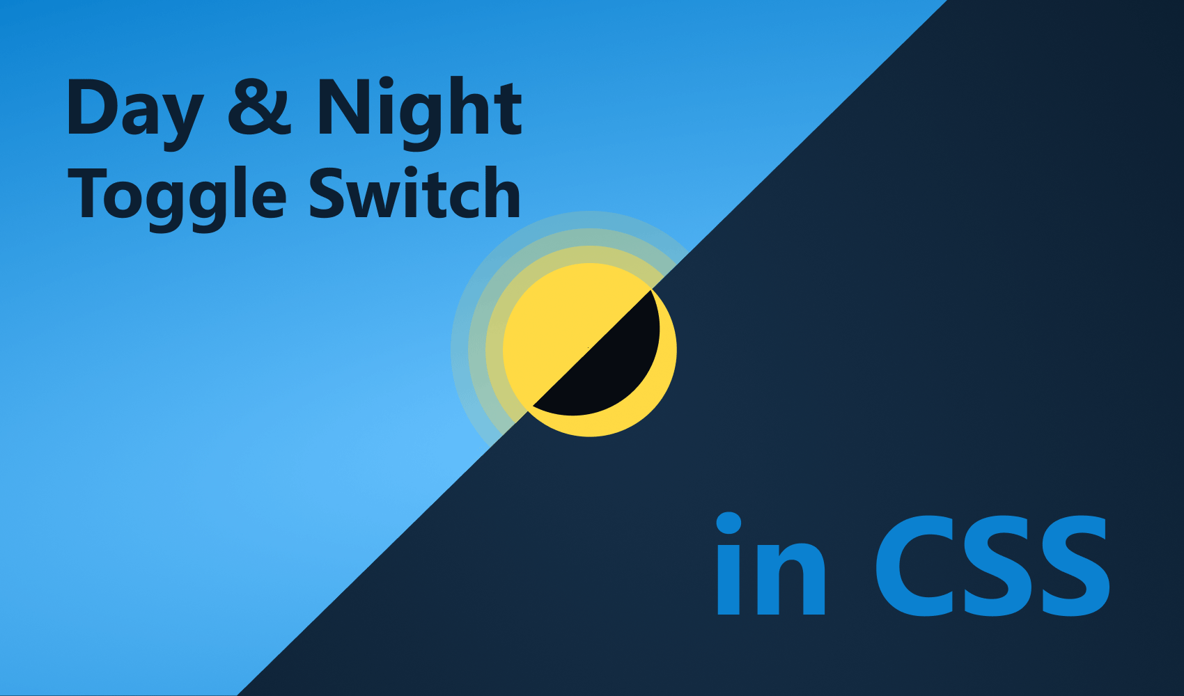
How to Make an Animated Day and Night Toggle Switch
 2021 11 November •
  8 min read
Providing an option for your users to toggle between a dark and light theme can be a great way to let them:
- Reduce the brightness of your site at night
- Save battery power when low
- Or just provide a different version of your site for their preference
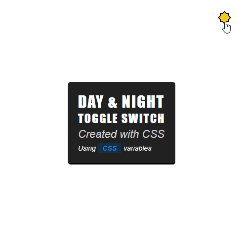
We will look at how you can create an animated toggle button with only CSS. We will also be looking at how you can use CSS variables to define different color schemes. And by the end of this tutorial, you will be able to build a light switcher, like the one below:
Setting Things Up
Create an index.html file at the root of your project and fill it with the following:
<!DOCTYPE html>
<html lang="en">
<head>
<meta charset="UTF-8" />
<meta name="viewport" content="width=device-width, initial-scale=1.0" />
<title>Day & Night Toggle Switch</title>
<link rel="stylesheet" href="colors.css" />
<link rel="stylesheet" href="styles.css" />
</head>
<body>
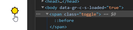
<span class="toggle"></span>
<div class="wrapper">
<h1>Day & Night</h1>
<h2>Toggle Switch</h2>
<p>Created with CSS</p>
<span>Using <b>CSS</b> variables</span>
</div>
<script src="toggle.js"></script>
</body>
</html>
We’re going to have three different resources:
colors.csswill hold all the color definitionsstyles.csswill hold the styles for the.toggleas well as the.wrappertoggle.jswill hold a click event listener for toggling classes
Let’s go over each and see what we need to add for them. At first, we want to create the toggle.
Creating The Toggle
Open up your styles.css and define the following styles for the .toggle:
.toggle {
position: absolute;
cursor: pointer;
top: 20px;
right: 25px;
font-size: 150%;
}
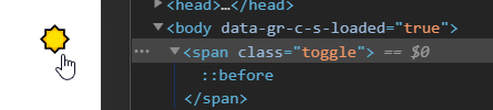
.toggle:before {
content: '☀️';
}
.toggle.active:before {
content: '🌒';
}I have to mention two important things here. First, you should set cursor to pointer to provide visual feedback to the user that the element can be interacted with. Secondly, we want to change the icon — which is in the content of the before pseudo-element — based on an .active class.

Of course, we don’t want to toggle the class through DevTools, so let’s add the event listener in JavaScript.
Adding the Event Listener
For this to work, we need the following function attached to the .toggle element.
document.querySelector('.toggle').addEventListener('click', function() {
    this.classList.toggle('active');
});At this point, we are able to toggle the icon on and off. To spice things up, let’s also add some animation.
Adding the Scaling Animation
The animation will work in the following way: We scale the icon down to 0. When it hits 0, the icon is essentially invisible. This is when we need to toggle the .active class to change the icon. Then we scale the icon back to its original size.

To achieve this, add the following to your style.css file:
.toggle.animate {
    animation: animate .3s cubic-bezier(0.4, 0.0, 0.2, 1);
}

@keyframes animate {
    0%   { transform: scale(1); }
    50%  { transform: scale(0); }
    100% { transform: scale(1); }
}We will animate the icon in 300ms to make the animation fast. To handle this through JavaScript, we will also need to modify our event listener a bit.
 document.querySelector('.toggle').addEventListener('click', function() {
+    this.classList.add('animate');

+    setTimeout(() => {
        this.classList.toggle('active');
+    }, 150);

+    setTimeout(() => this.classList.remove('animate'), 300);
});First, we need to add the animate class to start the animation. At the half of the animation — which is set to 300ms in styles.css, so we need to use 150 here — we toggle the .active class. At the end of the animation, we can remove the .animate class.

 Remove ads
Adding The Ripple Effect
To make the background transition feel like a wave, we can use a CSS trick instead of changing the background-color property. We will animate the box-shadow instead. For this to work, we need a new element. Add the following line to your index.html file:
<!DOCTYPE html>
<html lang="en">
    <head>
        ...
    </head>
    <body>
        <span class="toggle"></span>
        <span class="wave"></span>

        ...
    </body>
</html>
Since we are already doing some animation on the .toggle element, we don’t want to animate its box-shadow, otherwise, we would get weird effects. That is why we need to use a separate element. Let’s define the styles associated with the it.
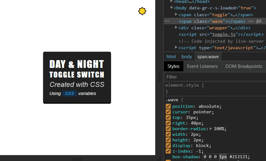
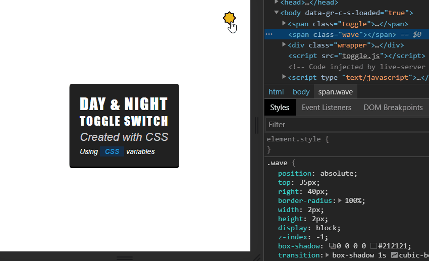
.wave {
    position: absolute;
    top: 35px;
    right: 40px;
    border-radius: 100%;
    width: 2px;
    height: 2px;
    display: block;
    z-index: -1;
    box-shadow: 0 0 0 0 #212121;
    transition: box-shadow .3s cubic-bezier(0.4, 0.0, 0.2, 1);
}

.wave.active {
    background: #212121;
    box-shadow: 0 0 0 9999px #212121;
}Some important things I would like to point out:
- The
.waveneeds to be positioned exactly in the middle of the icon, so it starts growing from its inside. - Its
border-radiusneeds to be set to 100% to be circular. - Why the
2pxfor width and height? This is the smallest size on whichborder-radiusworks. - You’ll also need to set
z-indexto -1 to make sure it doesn’t cover other elements on the page. - I set the
background-colorpurposefully to black on the.activestate to prevent a white dot showing in place of the icon, when it’s invisible.
If we start changing the size of the box-shadow, we can see that the background slowly turns into darkness. Let’s also update the event listener in JavaScript:
document.querySelector('.toggle').addEventListener('click', function() {
    this.classList.add('animate');

    setTimeout(() => {
        this.classList.toggle('active');
        document.querySelector('.wave').classList.toggle('active');
    }, 150);

    setTimeout(() => this.classList.remove('animate'), 300);
});
Adding Color Definitions
All that’s left to do is to add the color definitions so we have different styles for different themes. Open up your colors.css file and fill it with the following content:
html {
    --background: #212121;
    --box-shadow: #000;
    --text: #FFF;
    --text-faded: #CCC;
    --badge-background: #162F48;
    --badge-color: #0B81D0;
}

.theme-dark {
    --background: #FFF;
    --box-shadow: #CCC;
    --text: #212121;
    --text-faded: #333;
    --badge-background: #FFDA44;
    --badge-color: #d35400;
}As you can see, we don’t have anything, besides the colors. All we are doing here is rewriting the CSS variables for different themes. Again, we want to toggle a class, but this time, on the HTML element itself.
document.querySelector('.toggle').addEventListener('click', function() {
    this.classList.add('animate');

    setTimeout(() => {
        this.classList.toggle('active');
        document.querySelector('.wave').classList.toggle('active');
        document.documentElement.classList.toggle('theme-dark');
    }, 150);

    setTimeout(() => this.classList.remove('animate'), 300);
});This is the last thing to add in the .toggle event listener. So how would you use these variables inside CSS? Instead of hard-coding colors, you can use the var function to retrieve the values from the defined colors.
.wrapper {
    position: absolute;
    top: 50%;
    left: 50%;
    transform: translate(-50%, -50%);
    padding: 20px;
    background: var(--background);
    color: var(--text);
    border-radius: 5px;
    box-shadow: 0 3px 0 0 var(--box-shadow);
    transition: all .3s cubic-bezier(0.4, 0.0, 0.2, 1);
}Make sure you add a transition property to smoothly animate the colors. All that’s left to do is to test everything out.
Summary
In roughly 10 lines of JavaScript code, you are able to create a day-night toggle switch to help your users in various ways. It’s easy to implement and highly customizable. With the help of CSS variables, you can also create multiple themes by simply adding another class with another set of color schemes.
If you would like to experiment with the finished project, you can clone it from GitHub. Thank you for taking the time to read this article. Happy coding!

Rocket Launch Your Career
Speed up your learning progress with our mentorship program. Join as a mentee to unlock the full potential of Webtips and get a personalized learning experience by experts to master the following frontend technologies:
Courses

CSS - The Complete Guide (including Flexbox, Grid and Sass)

The HTML & CSS Bootcamp

The Creative HTML5 & CSS3 Course
Recommended
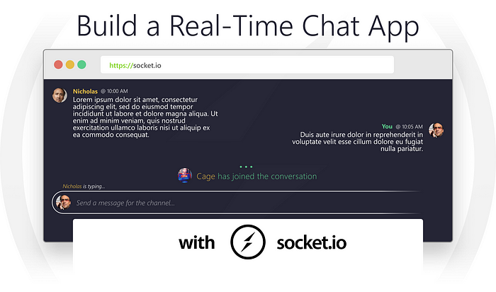
How to Make a Real-Time Chat App With Socket.io
2021 11 November • 17 min read
How To Easily Fetch Data With React Hooks
2021 11 November • 7 min readHow To Make Dynamic Backgrounds With The CSS Paint API
2021 11 November • 10 min read