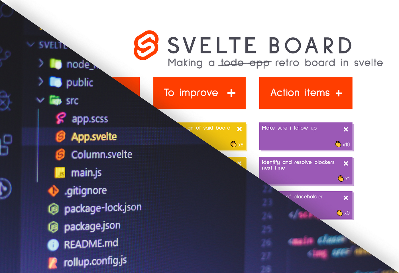
Looking into Svelte 3
If you’ve been a frontend developer you know that new releases of new frameworks are popping up every now and then. It seems like this trend hasn’t been slowing down.
Although Svelte has been around for a while now, version 3 has been just released a couple of months ago. It describes itself as a
radical new approach to building user interfaces
But why is it radical and how does it differ from other big frameworks like React, Angular, or Vue?
First of all, we need to point out that Svelte is a compiler, meaning it will generate your code at build time and only include JavaScript from the framework you actually use. This means that your bundle size will be smaller at the end which results in a more lightweight, faster app.
This also means that there’s not going to be a boilerplate code for your project. If you happen to write a hello world app, your bundle is not going to be 2MB, because if you don’t use anything from the framework, nothing from it will be included in the final build.
Reducing the amount of code you write is also an important aspect for Svelte. The following comparison is taken from the official site, comparing the same component in React and Svelte:
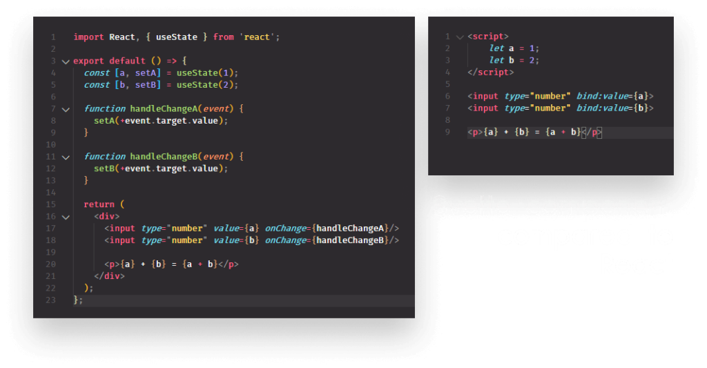
It also tries to bring reactivity at its core, there’s no need for external state management libraries.
To try and demonstrate its advantages while also covering core functionalities, we will create a retro board from scratch. Here is the initial design I came up with for the tutorial:
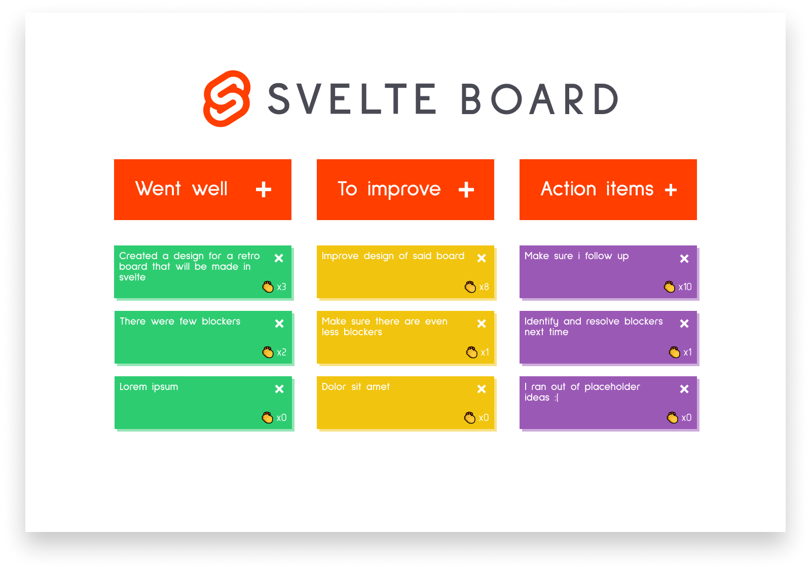
A classic three-column layout where you can post notes about what went well, what to improve on, and some action items to follow up. Users will be able to create, delete, edit, and clap each post-it.
I will provide a GitHub link for the project at the end of the article so you can avoid messing around with CSS first and jump straight into coding. So without wasting more time, let’s jump into setting up Svelte.
Setting Up Svelte
The easiest and simplest way to start with Svelte is to head over to svelte.dev and either run this command if you have degit installed:
npx degit sveltejs/template svelte-board
or download and extract the zip file from the provided link. Either way, you will get the same template.
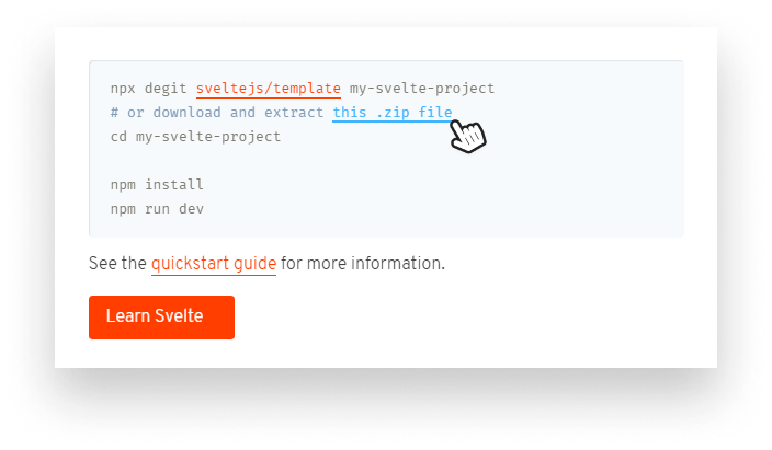
Install dependencies with npm i and run the server with npm run dev and you’re all set. If you look at the initial project structure, you will notice that Svelte uses rollup as a bundler. We are also presented with a public and a src folder. Everything that will be a publicly available asset, like fonts or images are supposed to go inside the public folder. Anything else related to your app should be in the src folder.
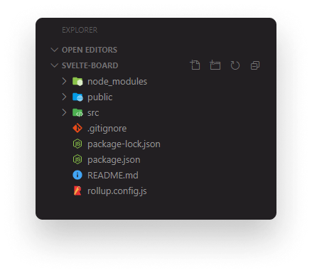
In the src folder, you’ll find an App.svelte file. You can delete the contents as we won’t use anything from it.
Now whenever I’m dealing with a new project, my first step is to get sass up and running to help me with CSS. As this article is supposed to be about Svelte, I won’t go into detail on how I replicated the design, instead I’m only going to guide you through how you can add support for sass.
Adding SCSS Support
For adding support, we’re going to need to npm i rollup-plugin-scss. After it’s done, open up your rollup.config.js file and add the following line to the end of the imports:
import scss from 'rollup-plugin-scss';and call it with scss() at the end of the plugins array.
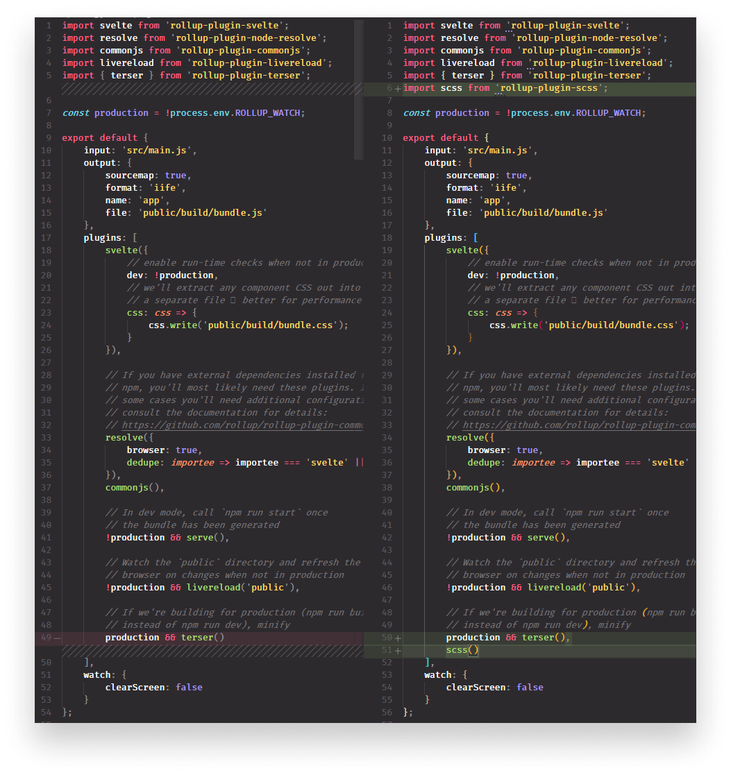
All you have to do now is create an .scss file in your src folder and import it into main.js.

Creating Svelte Components
The next step is to create the main component. Svelte components have three main parts.
<script>
    // Scripts goes here
</script>

<style>
    // Scoped styles goes here
</style>

<!-- Everything else goes here -->They have a script tag where the functionality of the component goes. They have a style tag where the styles live for the related component. It is scoped to the component by default so there’s no style collision. And of course, you have the markup itself.
If you’re not a fan of keeping scripts, styles, and templates together in one file, you can use import statements to import your scripts and CSS. For now, we can keep everything in one place.
To start out, add an empty script tag and the following to your App.svelte file:
<script>

</script>

<main class="app">
    <img src="assets/images/svelte-board.png" alt="logo" class="logo">

    <section class="grid">
        <div class="actions">
            <button>Went well <img src="assets/images/add.png" alt="add"></button>
            <button>To improve <img src="assets/images/add.png" alt="add"></button>
            <button>Action items <img src="assets/images/add.png" alt="add"></button>
        </div>

        <div class="columns">
            <div class="column column-1">
                <div class="item">
                    <span class="content">The content of the post-it</span>

                    <button class="remove">x</button>
                    <span class="claps">👏x0</span>
                </div>
            </div>


            <div class="column column-2">
                ...
            </div>

            <div class="column column-3">
                ...
            </div>
        </div>
    </section>
</main>We will have three columns. Every column will have an item that will contain relevant information about the note; it’s content, the number of claps on it, and a remove button.
This is all static content, so let’s make it dynamic. We’re going to need to store the list of items we already have on the board, so let’s create a multidimensional array inside the script tag:
<script>
    let columns = [
        [{ content: 'Everything went well 👌' }],
        [],
        []
    ];
</script>Each array will hold information about one column. Inside each array, we will have a list of objects with a content property. To display them in the template, we can use template expression and text literals.
Template expressions
Let’s display the contents of columns from the script tag by using the #each expression:
<div class="columns">
    <div class="column column-1">
        {#each columns[0] as item}
            <div class="item">
                <span class="content">{item.content}</span>

                <button class="remove">x</button>
                <span class="claps">👏x0</span>
            </div>
        {/each}
    </div>


    <div class="column column-2">
        {#each columns[1] as item}
            ...
        {/each}
    </div>

    <div class="column column-3">
        {#each columns[2] as item}
            ...
        {/each}
    </div>
</div>Logic blocks and dynamic content is denoted by curly braces in Svelte. Apart from #each, you can also use #if block, and my favorite, #await for dealing with promises:
{#await promise}
      <p>loading...</p>
  {:then response}
      <p>{response.text}</p>
  {:catch error}
      <p>{error.message}</p>
{/await}Back to the board, we will have the same content inside each column, meaning it’s a perfect opportunity to outsource them into a separate template that we can call inside each loop.
Using nested components
Create a new file in your src folder called Column.svelte and copy-paste the content of the post-it note into it.
<script>
    export let content;
</script>

<div class="item">
    <span class="content">{content}</span>

    <button class="remove">x</button>
    <span class="claps">👏x0</span>
</div>We’re going to need to pass the content of the post-it to the Column component and in order to do so, we have to export it here. We can now simplify our columns by importing the new component into the App component and use it inside the #each blocks.
<script>
    import Column from './Column.svelte';
</script>

<div class="columns">
    <div class="column column-1">
        {#each columns[0] as item}
            <column content="{item.content}">
        {/each}
    </column></div>

    <div class="column column-2">
        {#each columns[1] as item}
            <column content="{item.content}">
        {/each}
    </column></div>

    <div class="column column-3">
        {#each columns[2] as item}
            <column content="{item.content}">
        {/each}
    </column></div>
</div>To pass the content of the items as a prop into the Column component, we can follow the same pattern React uses.
We have a pretty clean template now, so let’s start adding some functionality.
Event Handlers In Svelte
We want to have four different interactions in our app:
- Add new items
- Remove items
- Edit existing items
- And clap them if we like the idea.
Let’s start with the adding and removing functionality.
To add new items, we want to push a new object into the columns variable. We want this to happen whenever any of the button below is clicked:

Let’s first create the function for it. Add the following to your script tag:
<script>
    const addItem = (column) => {
        columns[column] = columns[column].concat({
            content: "You can start editing by clicking here... 🙌"
        });
    }
</script>Whenever an action button is clicked we call this function with an index, either 0, 1, or 2, depending on which column we want to add items to. All we do is here reassign the columns variable to an extended version of columns.
Why we are not using Array.push here, as we would elsewhere? This is because array mutating calls won’t trigger a re-render in Svelte. Instead, you need to reassign the variable. This is because Svelte reactions are based on assignments.
To add the function calls to the template, we can use on:click handlers:
<div class="actions">
    <button on:click={() => addItem(0)}>Went well <img src="assets/images/add.png" alt="add" /></button>
    <button on:click={() => addItem(1)}>To improve <img src="assets/images/add.png" alt="add" /></button>
    <button on:click={() => addItem(2)}>Action items <img src="assets/images/add.png" alt="add" /></button>
</div>To pass params into the function, we can create an arrow function where we call addItem with the index of the column.
To remove them, we can add another on:click to the remove button inside the Column component and a single line to the script tag, which will remove the parent element from the DOM:
<script>
    const remove = (e) => e.target.parentElement.remove();
    export let content;
</script>

<div class="item">
    <span class="content" contenteditable="">{content}</span>

    <button class="remove" on:click="{remove}">x</button>
    <span class="claps">👏x0</span>
</div>I also added the contenteditable attribute to the content so users can edit it. All that’s left to do is implementing the clapping functionality.
For that, we can simply add a claps variable to the component and display its value. Every time we click on the element, we increase its value by 1:
<script>
    let claps = 0;

    const clap = (e) => claps++;
</script>

<div class="item">
    <span class="content" contenteditable="">{content}</span>

    <button class="remove" on:click="{remove}">x</button>
    <span class="claps" on:click="{clap}">👏x{claps}</span>
</div>Adding some animations
Let’s wrap things up by adding a cool slide-in animation. Svelte provides some nice API for simple fading, sliding, scaling, and blurring animations. The in: and out: events are used for animating an element in and out.
Import fly from svelte/transition and add it to the item:
<script>
    import { fly, scale } from 'svelte/transition';
</script>

<div class="item" in:fly="{{ y: 200, duration: 300 }}">
    ...
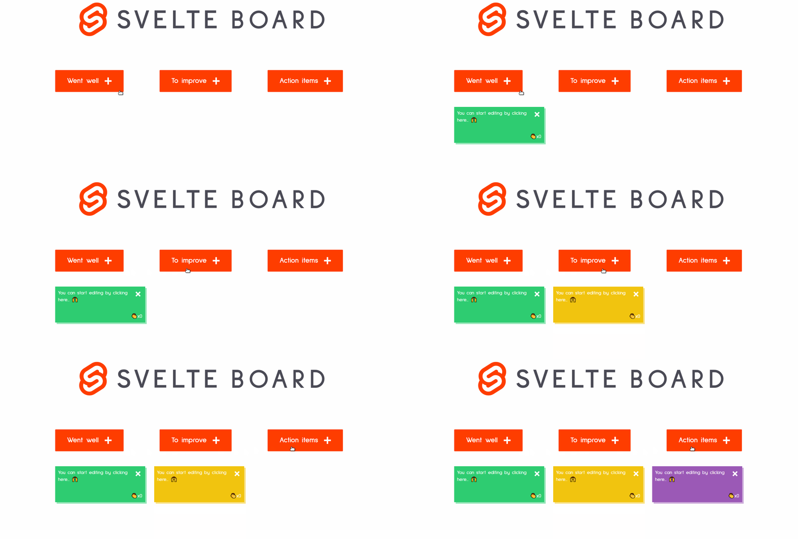
</div>This will animate each item in starting from -200px from its end position under 0.3 seconds:
Summary
As promised, you can clone and tweak around with the project from GitHub.
Svelte is really fun to play with, there’s a ton of potential. It’s easy to get started, the learning curve is not steep. If you happen to stuck, the documentation is extensive and you have a number of examples ready at your disposal.
You can also play around with it online and download your code as soon as you start to outgrow it.
If you would like to learn more about using Svelte, check out how you can use it to create desktop apps:
If you haven’t started yet, go ahead and give Svelte a try! Otherwise, leave your thoughts on the framework. Thank you for sticking around and happy coding!


Rocket Launch Your Career
Speed up your learning progress with our mentorship program. Join as a mentee to unlock the full potential of Webtips and get a personalized learning experience by experts to master the following frontend technologies:
