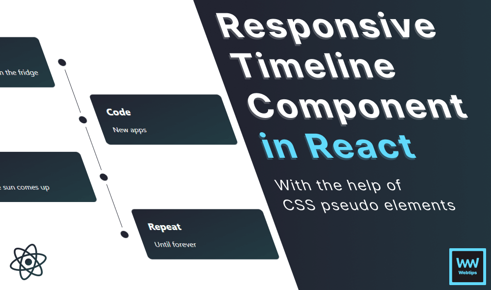
How to Create a Responsive Timeline Component in React
 10 min read • React v18.2
A timeline component is often used to graphically represent events or activities displayed chronologically along a horizontal or vertical axis. It allows users to visualize the sequence of events over time, providing a clear understanding of the temporal relationships between different items.
In this tutorial, we'll take a look at how to create a Timeline component in React with the help of pseudo-element in CSS. By the end of this tutorial, we'll have the following responsive component ready that you can use in your projects:
Timeline component
Laying out the Component
First, let's see how we want to reference the Timeline component. It'll accept an items prop through which we can pass an array of timeline points for display:
import { Timeline } from './Timeline'

export const App = () => {
    const data = [
        {
            heading: 'Eat',
            content: 'Everything you find in the fridge',
        },
        { ... },
        { ... }
    ]

    return <Timeline items={data} />
}- Lines 4-11: Each item can have a
headingand acontentprop that will be displayed by the component. Here we can create as many elements as necessary. In a real-world scenario, this data would be retrieved from a backend service, such as a CMS. - Line 13: The
datavariable is passed to theitemsprop on theTimelinecomponent. This is the only prop we're going to need to build this component.
Building the Timeline Component
Now that we know how the timeline will function, let's take a look at the component itself. If you haven't already, create a new file called Timeline.jsx in your project and add the following code inside the file:
import classNames from 'classnames'
import './timeline.css'

export const Timeline = ({ items }) => (
    <ul className="timeline">
        {items?.map((point, index) => {
            const { heading, content } = point
            const first = index === 0
            const last = items.length === index + 1
            const even = (index + 1) % 2 === 0

            return (
                <li className={classNames(
                    'item',
                    even && 'even',
                    (first || last) && 'overlay',
                    last && 'last'
                )}>
                    <strong>{heading}</strong>
                    <span>{content}</span>
                </li>
            )
        })}
    </ul>
)
- Line 1: In this component, we make use of the popular
classNameslibrary that can be used to conditionally generate class names in React. - Line 2: Most of the component is made up of CSS. Make sure you import a dedicated CSS file where we organize the styles associated with the component.
- Lines 7-10: For improved accessibility, the element is displayed as an unordered list. We can loop through the items using a
mapto display the elements. Inside themap, we need to mark the first, last, and even items, which we can do using indexes.- first: The first item can be determined by checking if the
indexis0, meaning we're in the first iteration of the loop. - last: The last item can be determined by checking if the
indexmatches the length of the array. - even: Even items can be determined using the modulo operator. This returns the remainder of the equation when the operand (index + 1) is divided by the second operand (2). If this equation returns 0, it means there's no remainder, so iterations like 2, 4, and 6 will be marked as even.
- first: The first item can be determined by checking if the
- Lines 13-18: Using the
classNameslibrary, we can conditionally apply class names to thelibased on the aforementioned variables. We'll use these classes to apply different styles. The elements will always have an.itemclass, and they'll conditionally get an.even,.overlay, and.lastclasses when the variables are evaluated totrue. - Lines 19-20: Inside the
li, we can display theheadingandcontentproperties of each item that is passed to the component through theitemsprop.
 Remove ads
Styling the Timeline
Now that we have the necessary DOM elements for the timeline, let's see the styles we need for the mobile version. Inside the CSS file of the component, append the following:
:root {
    --timeline-padding: 32px;
}

.timeline {
    display: flex;
    position: relative;
    flex-direction: column;
    gap: 1rem;
}

.timeline strong {
    font-size: 21px;
}

.item {
    display: flex;
    position: relative;
    padding: 1.5rem;
    flex-direction: column;
    gap: 1rem;
    border-radius: 0.5rem;
    background: #222431;
    background: linear-gradient(to bottom right, #222431, #233d44);
    color: #FFF;
}When writing CSS, always follow a mobile-first approach to end up with less CSS.
:root: First, we need to create a CSS variable on the:rootelement. Depending on the padding of the timeline, this value could be different. In our case, we need to work with32pxto correctly align elements later on..timeline: Theulitself is displayed as a flex element, with aflex-directionset tocolumn, so that eachliis displayed under each other. The whitespace between elements is added with a1remgap. We'll also need to set itspositiontorelative, as we'll absolutely position the vertical line between the elements..timeline strong: To increase the weight of the heading, we can increase the font size. Depending on your use case of theTimelinecomponent, this element could also be replaced with anh2to use headings for SEO..item: The items themselves are also displayed as flex for easier alignment of child elements, with the same gap, small padding, and border-radius. We also use a linear gradient for the background. This one also needs to have itspositionset torelative, as we'll absolutely position the dots to these elements.
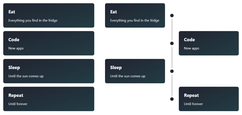
On small screen devices, we don't have enough space to display the classical timeline alignment of elements without distorting them, so we simply display them as a list of items. The above CSS rules will create the following layout:
- Code New apps
Adding Pseudo Elements
With these CSS rules present, we have the base styles for the element. There's only one thing left to do: add styles for the desktop version. First, let's add the proper alignment for the items. Extend the CSS with the following media query:
@media (min-width: 500px) {
    .item {
        width: calc(50% - var(--timeline-padding));
    }

    .even {
        align-self: flex-end;
    }
}This will ensure that each item will only take up half the width of the Timeline component. For every .even element, we'll display them on the right side using align-self: flex-end. With these rules in place, we'll have the following layout:
 timeline.css
 Timeline.jsx
- App.jsx
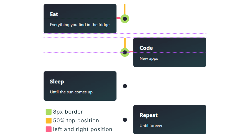
To add a vertical line in the middle, we can extend the CSS with an ::after pseudo-element on the .timeline. Append the following CSS in the editor above to create a vertical line between the elements:
.timeline::after {
    content: '';
    position: absolute;
    width: 1px;
    background: #222431;
    left: 50%;
    height: 100%;
    z-index: -1;
}This works by absolutely positioning the element with a 1px width and 100% height to the center of the .timeline using left: 50%. Note that we've also set its z-index to -1. This is because we want this element to appear behind the dots that we'll add next. To create the dots, we need to target the ::before pseudo-element of the .item elements. Extend the CSS with the following rules to add the dots:
.item::before {
    content: '';
    position: absolute;
    background: #222431;
    width: 1rem;
    height: 1rem;
    border-radius: 100%;
    top: 50%;
    right: calc(var(--timeline-padding) * 2 * -1);
    transform: translate(-50%, -50%);
    border: 8px solid #FFF;
}

.even::before {
    content: '';
    left: calc(var(--timeline-padding) * -1);
    right: auto;
}This will create the dots next to each element. To horizontally center the dots with each .item, we can use top: 50%, and translate(-50%, -50%). We also use an 8px border with the same color as the background to create the illusion of breaking up the vertical line. For .even elements, we need to switch the positioning from right to left, using the same CSS variable.
To create negative values with CSS variables, we have to multiply the value by -1.
There's one last thing missing from our CSS. Currently, the vertical line extends above and below the first and last elements. We can remove these by adding overlay elements using another pair of pseudo-elements. To finish the component, we need to extend it with these last sets of CSS:
.overlay::after {
    content: '';
    position: absolute;
    top: 0;
    right: -40px;
    background: #FFF;
    width: 1rem;
    height: calc(50% - 8px);
}

.last::after {
    top: auto;
    bottom: 0;
}

.last.even::after {
    left: -40px;
}These elements have the same background as the page. We need a 50% height for them from the top (for the first .overlay) and bottom (for the .last element). Note that we need to change the right position to left for .even elements, to ensure the overlay is correctly positioned, regardless of whether we have an even (e.g. 4) or odd (e.g. 3) number of elements.
Summary
Congratulations! You've just completed the creation of your very first Timeline component in React! Interested in elevating this project even further? Here are some ideas on how to enhance the functionality of this component:
- Allow the use of HTML for the content.
- Enable configuration of styles to make it reusable with different variants.
- Implement virtualized loading for large lists.
Are you looking for more React projects? Check out our React projects roadmap, a comprehensive guide that offers inspiration on what to build next and how to approach it. Thank you for reading, and happy coding!


Rocket Launch Your Career
Speed up your learning progress with our mentorship program. Join as a mentee to unlock the full potential of Webtips and get a personalized learning experience by experts to master the following frontend technologies:
Courses


Recommended

How to Create Dynamic Routes in Astro
9 min read
How to Work With Event Listeners in Astro
11 min read
How to Work With CSS in Astro
9 min read